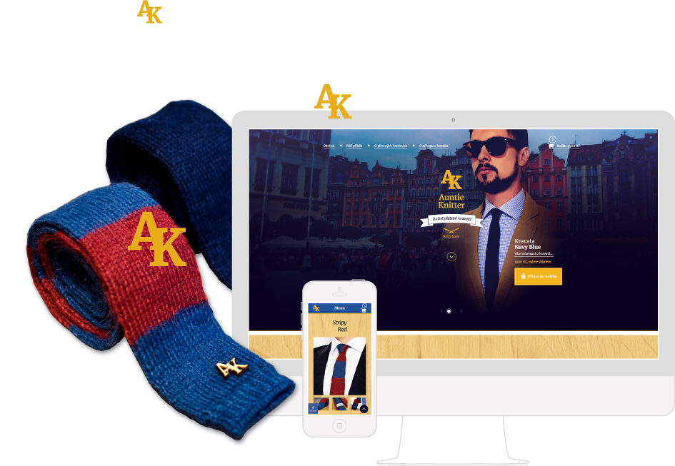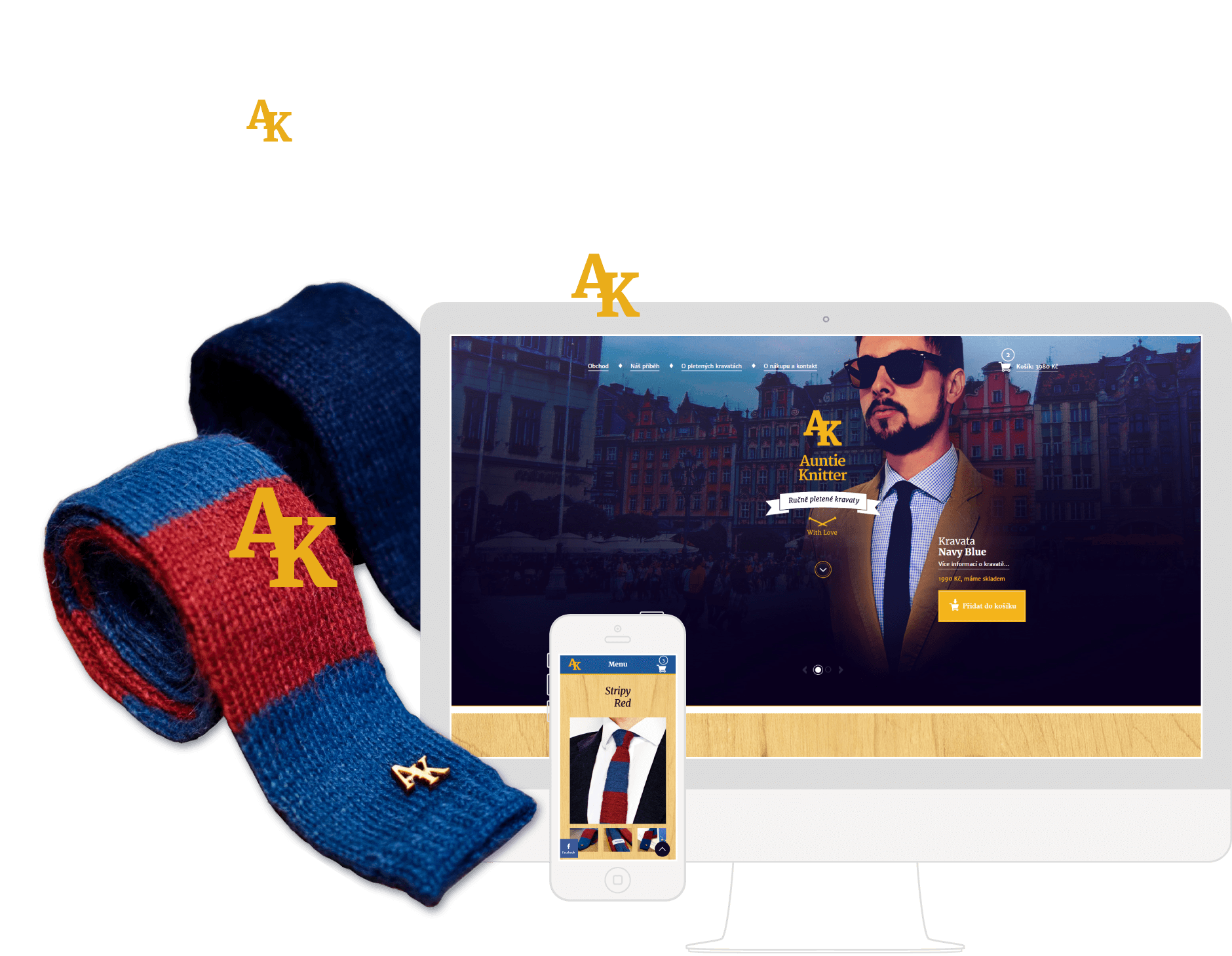
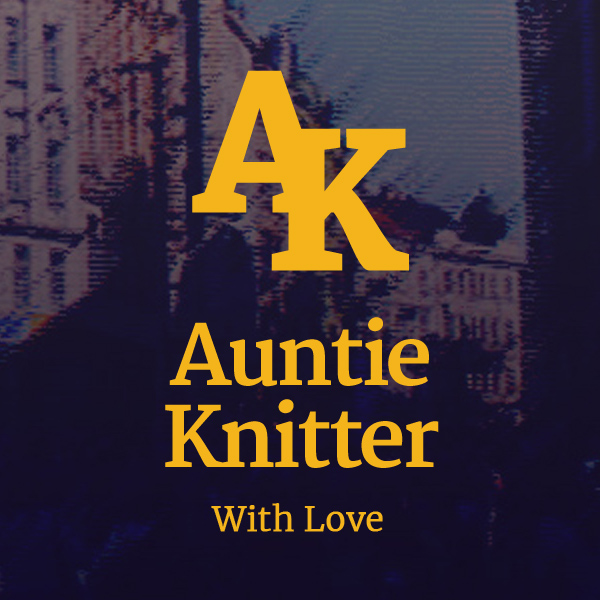
Auntie Knitter –
Knitted Ties E-shop
Visual identity and website for business with knitted ties
Webdesign • Sep 2015
↓
Webdesign • Sep 2015
Do you like ties? And do you find the classic ties nice, but too formal? Then this is for you... For all of you who want to be stylish during night outs or any casual occasions. For rebellious gentlemen.
The Auntie Knitter is a brand producing handmade knitted ties making happy everyone interested in unique fashion accessory. These knitted ties are created by Czech aunties and we launched this project to make the aunties and their knitting legacy noticed. As a graphic & webdesigner, I am behind the creation of all brand visuals and also the Auntie Knitter website.
I was a part of the Auntie Knitter project from the very beginning and I remember when the idea author Michal Stancik introduced me his vision. It was unique and I liked it! We needed to create a brand identity, prepare necessary visuals and design a web solution which will allow us to sell the knitted ties and manage orders online.
Firstly, we found a name of the brand based on the story and specified the value proposition. Then I created essentials of the visual identity including a logotype, colours palette and the visual style reflecting the customers we wanted to address.
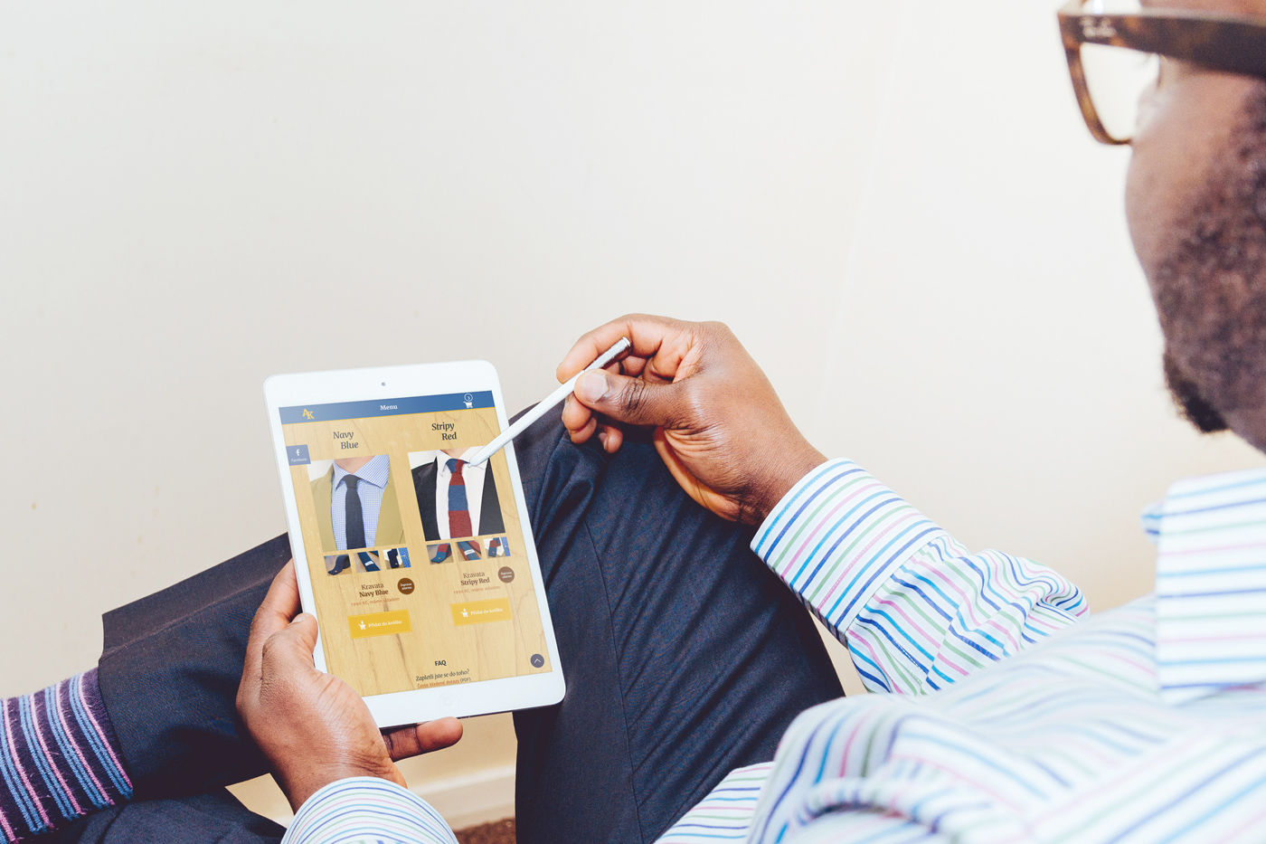
Once the visual identity was created, I designed the website introducing the story and products. As the last step, I build the website on Wordpress and its WooCommmerce plugin. The visitors can now order knitted ties from the website and all orders are easily manageable from the administration.
Graphic Designer, Webdesigner / Developer
Since the project had a limited resources, we started as a team of two. Later, we asked a photographer and a copywriter to join and help us with the content. Michal Stancik was working mainly on the physical products in a cooperation with his auntie and he also managed the project.


We made the idea of men's fashion accessory alive. We founded a new brand and created its two unique products – hand-crafted knitted ties which are available to buy.
A new brand would not get much attention without any promotion. Thanks to the created visual materials and the website, people started to get in touch with the Auntie Knitter.
Lastly, our hand-crafted ties are available to buy online thanks to the e-shop we launched for the project. On top of that, the customer service can easily see and manage orders from visitors of the website.
Having just a rough idea and a few prototypes of knitted ties, I started with learning about the author's business vision. Then, we specified the strategy and researched the competitors.
We also put together the story and value proposition with a unique selling point. To learn about our potential customers, we created customer archetypes (proto-personas) which we were continuously refining.
Once I gathered enough information about the business and customers, we performed several idea sessions.
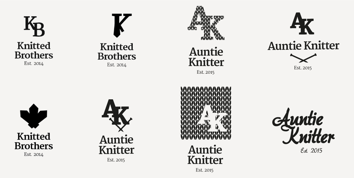
We chose the brand name (moved from Knitted Brothers to Auntie Knitter to support the story of the ties knitted by Czech aunties) and agreed on a general visual style (I use mood boards for these purposes). Finally, we also defined the products line.
Based on the research and agreed style (captured by words as a gentleman, royal, rebellious, hand-crafted) I designed the visual identity.
I chose font Merriweather for its stylish serif look and easy online use. From several logo variants, we decided for a simple composition reusing first letters of the brand name (we planned to use the logo also as small wooden badges). We chose to use gold and navy blue colours because we believe they fit well the desired style.
Thanks to the research and created visual identity, we had a good foundation for the website design. Since we wanted to show just the story, products and contacts, I decided to use single page layout.
I sketched some layout ideas on a paper first and then moved to wireframes. We defined the content, structure and prominence of information. After that, I created detailed designs based on the wireframes and desired style.
During the design stage, we performed also basic user testing (Guerilla). That, for example, convinced us to move the section with products just under the header where the story was before.
In my previous projects I got familiar with coding and deployment of Content Management Systems. I reused that knowledge and coded the designs on my own.
We chose to use Wordpress because of my positive experience from the past, the easiness of use and the possibility to install WooCommerce plugin for online selling system. I also optimised the website in terms of loading speed to support its good usability.
Before starting any detailed design, it is important to understand the business and the potential customers. Do research and perform design workshops with the client and also with co-workers. It’s beneficial for the final results.
Tight deadlines often need flexibility and compromises. It is a good approach to create Minimum Viable Product as soon as possible and continue with improvements afterwards. Then, testing the solution with real people is essential. It positively impacts the whole business (conversions, happy users, etc.).
The default installation of an open source content management system can be slow and that can have a bad impact on overall usability. Because of that, it is really worth to focus on the website performance optimisation.
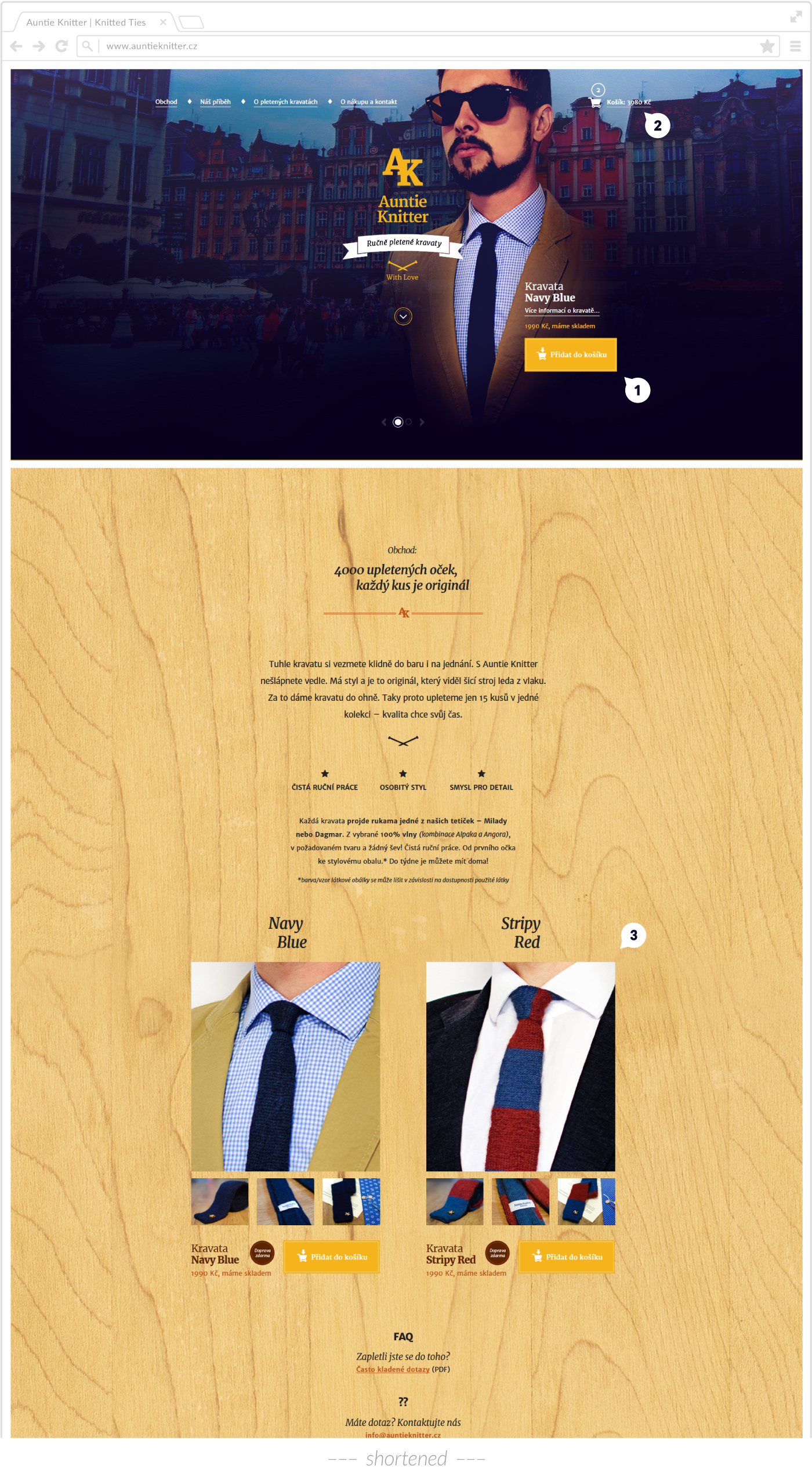
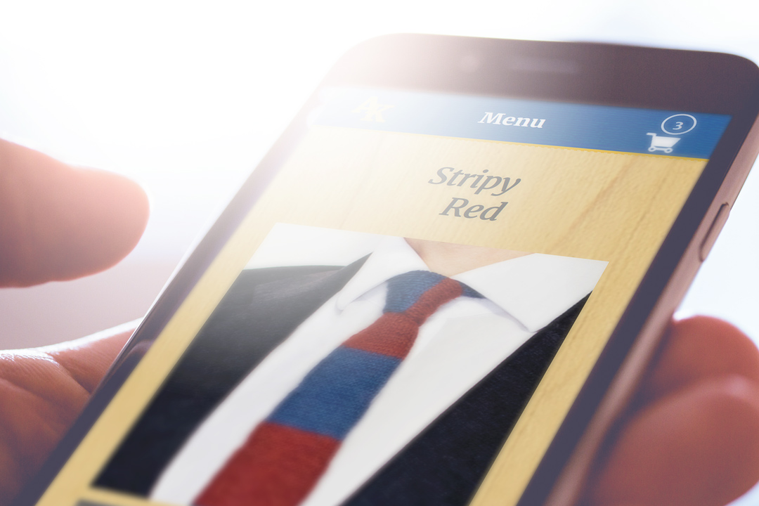
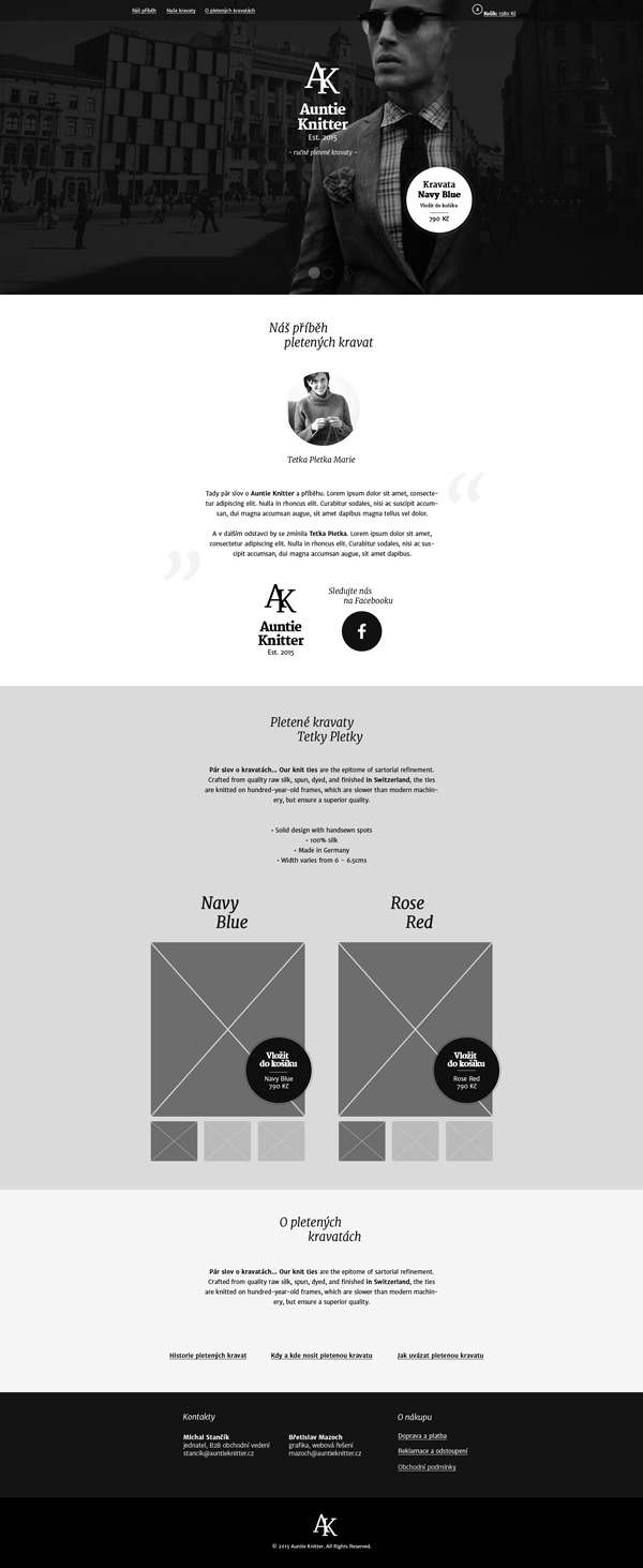
The header of the homepage is designed as timed carousel showing two products (Navy Blue, Stripy Red). The idea behind this solution is to allow visitors view and buy a tie as soon as the website is loaded. To support that idea we show there also very prominent call-to-action button “Add to the cart”.
The homepage is designed as single page layout. We wanted to display information about products and the story in light and simple structure (Shop, Our story, About ties, Contacts). The buying process then includes individual pages (the cart, checkout and confirmation).
The products gallery is an important section and that is the reason why we placed it just under the header. For comfortable previews, we provide very smooth lightbox functionality. Under the photos, we show again a prominent “Add to the cart” call-to-action button to make buying easy and intuitive.
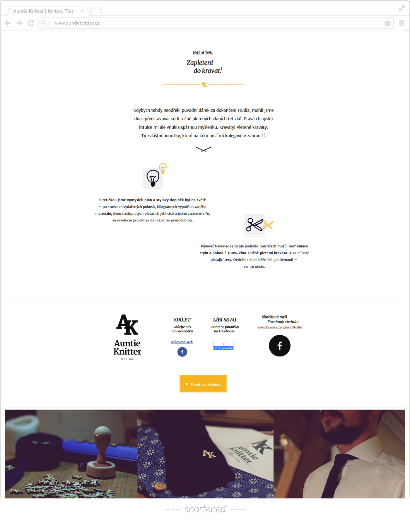
The story is shown just under the products section on the white clean background. The idea is to increase the contrast among the sections and increase also the story prominence, once the visitors scroll to that area.
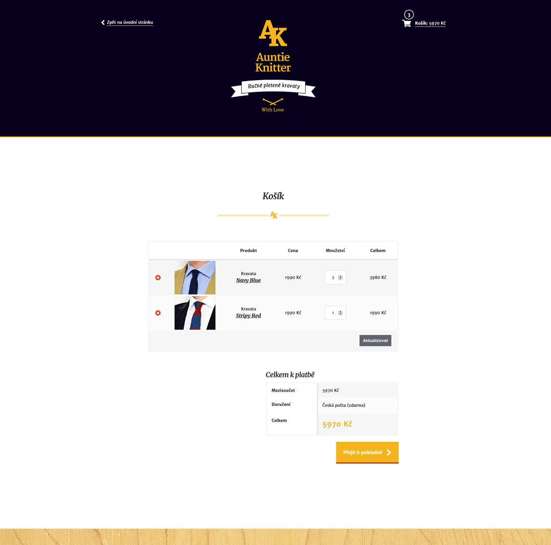
The visitors can proceed to checkout from the cart page (shown above), where is available the order summary.
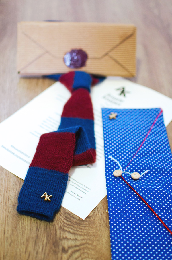
Every customer gets the tie in a special gift package including an introduction letter and original textile envelope.
Let’s work together! I'm especially interested to help projects focused on healthcare, smart technologies, or project management.
Feel free to contact me at → bretislav.mazoch@gmail.com
Explore 2 more case studies.

As a UI Designer, I managed UI style guide of the main product. We extended the style guide which led to better UI consistency, better usability and increased amount of designed features. For example, one of the new features sped up the management and import process of any patient document by clinical staff.
Case study →
As a UI Designer, Developer and 3D Artist of the project I produced medical 3D visualisations and created a unique 3D viewer for displaying the visualisations in web browsers. The viewer supports people from the university (medics, tutors and students) in teaching and studying.
Case study →